Mapping The European Union 2019
This is a cutting-edge piece of data visualisation software that allows users to explore the geography, social factors and politics of the European Union. It is designed to give all users an interactive, intuitive and engaging experience, with a focus on evidence-based learning and self-directed exploration.
Mapping the European Union is a stand-alone application that is available for Windows PC and Mac. It can be downloaded onto any modern computer via the internet and does not require an internet connection to use the application. This page introduces the concept and features of the app, and we highly recommend viewing the video or trying it yourself first-hand. This piece of software is available as a free download. You can find the download link below the video.
The Interactive Map
The map itself is an accurate representation of the countries in and around Europe It shows their borders, capital cities and other major settlements. Users can navigate the map on foot, using either a mouse and keyboard or a gamepad. The scale of the map is about 1 to 10,000 which means that you can jump across the English channel, or run from Denmark to the tip of Italy in 30 seconds.
Users can view the map from a first-person perspective (through the eyes of your character) or from a third-person perspective (above and behind them). It’s also possible to zoom out and move around more quickly from a birds’ eye view.
Mapping the EU allows users to access a large amount of interesting and insightful data. It’s all presented in a way that makes it is easy to understand, regardless of the user’s level of education or expertise.
There are several viewing ‘modes’ available, with each one focusing on a particular type of information. Simply switch between the five modes by pressing Enter:
1. Country mode Shows statistical information about individual countries.
2. Statistics mode Shows statistical comparisons on a colour-coded map.
3. MEP mode Shows details about all 750+ members of the EU parliament.
4. Candidate mode Shows details of 2019 election candidates and constituencies.
5. Geography mode Shows national borders, capitals and major cities.
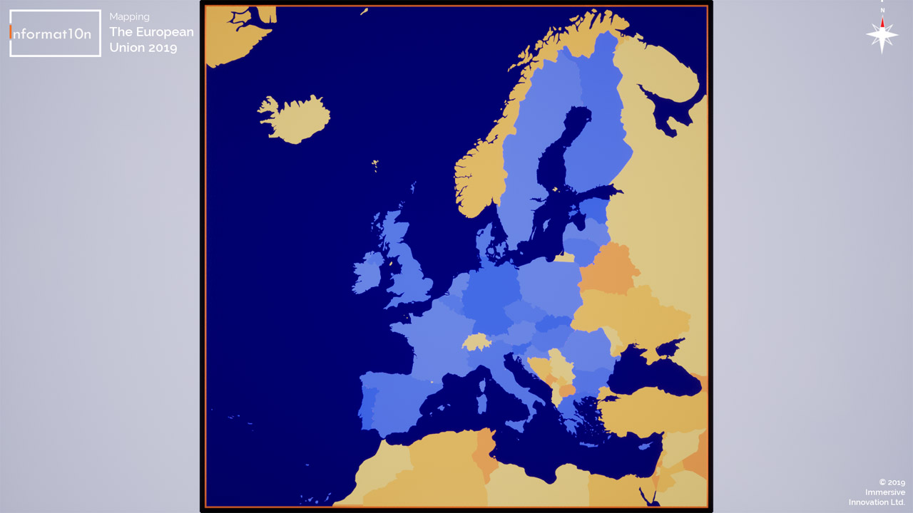
This screenshot shows the entire 3D map from above. EU member states are shown in blue, with non-members shown in orange. Users can explore the map from a first-person, third-person or overhead perspective as they navigate the map and view its data.
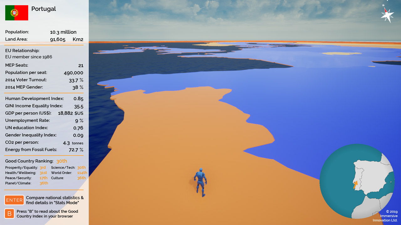
In this screenshot you can see the statistics that are displayed in “Country Mode”. This mode allows users to see detailed stats about each individual country by visiting it on the interactive map. These statistics are shown for all nations on the map, including non-EU members.
Exploring the Data
Country Mode allows users to navigate the map and access a wide variety of statistics about each country that they visit. These statistics include information about demographics, economics, education, equality, ecological impact and influence within the European Union. Data sources include the United Nations, World bank, EU institutions and the Good Country index.
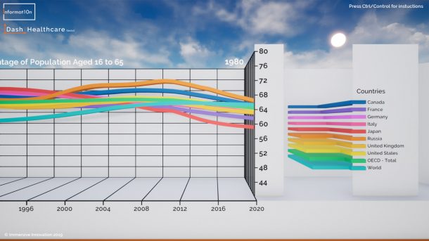
Statistics Mode presents users with a selection of beautifully informative data visualisations. These show statistical comparisons between all of the EU member states, as well as Norway and Iceland. Users can also change the style of these visualisations.
MEP Mode provides information about all the members of the current European parliament. The MEPs from each country are shown on the map, next to their capital city. Users can view details about each MEPs national party, EU parliamentary group, and results form the most recent election.
Candidate Mode allows users to explore the representatives who have put themselves forward for the next EU parliamentary election. The map is divided into constituency regions, with each political party and a list of its candidates shown in each region. This demo version of the app only provides details of candidates from the UK.
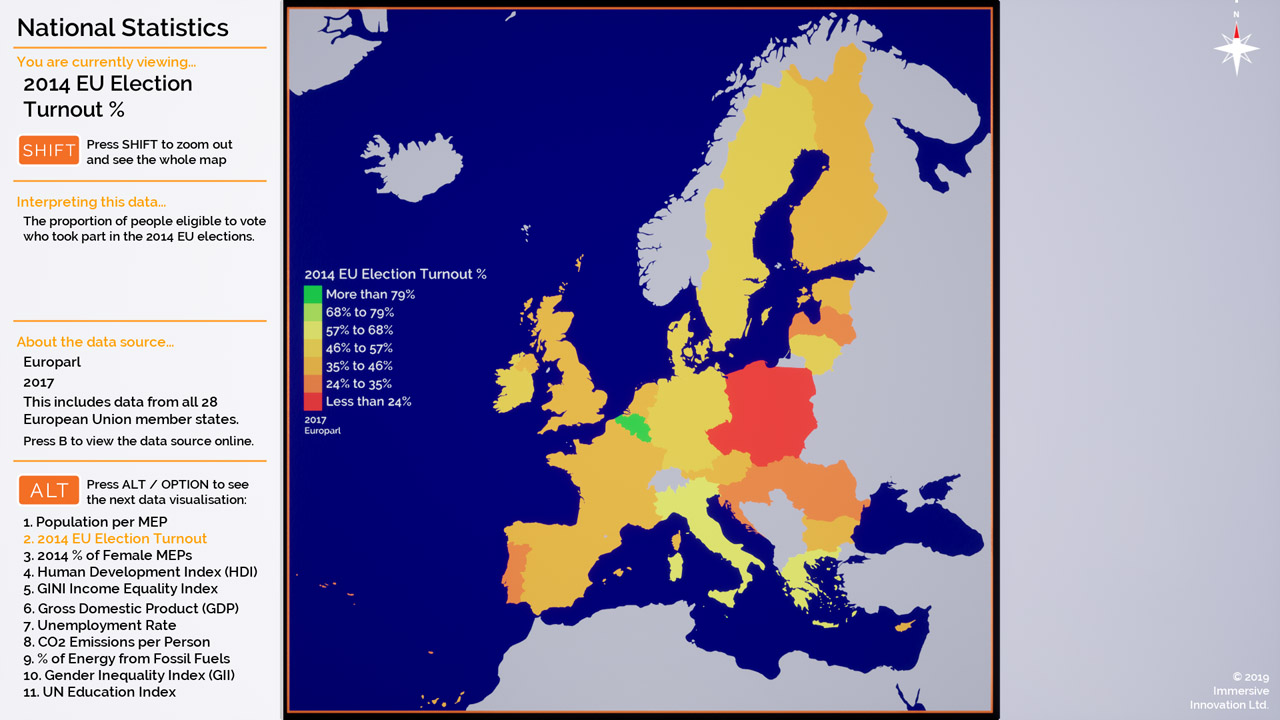
This is an example of one of the data visualisations shown in “Statistics Mode”. Users can compare national statistics and view these on a colour-coded map. It includes all 28 EU members and the visualisation can be customised with a range of colour styles.
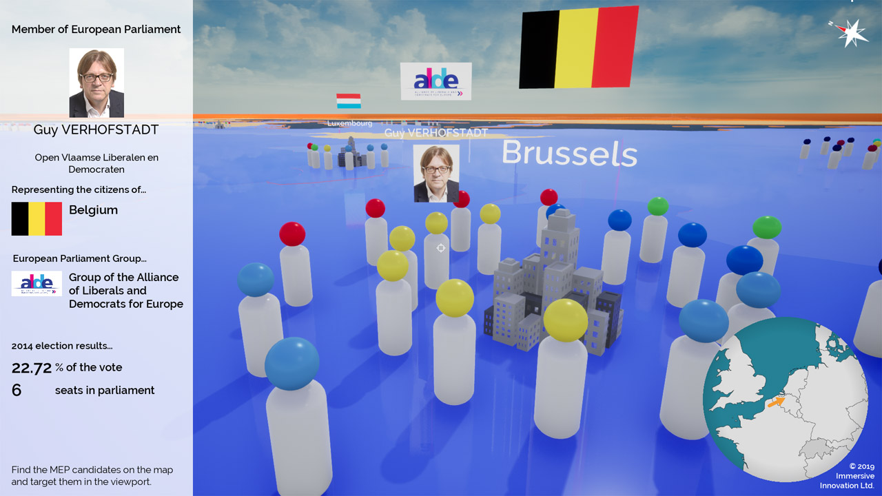
Every member of EU parliament is shown on the map in “MEP Mode”. Users can explore the map and view individual representatives in each country, along with their european and national party affiliations. It includes more than 700 MEPs and also shows voting results from the 2014 elections.
Sharing and creating content
This is a versatile piece of software that has been designed for a number of uses. Individual users and groups can use the information and data visualisations within the app for research, presentations, academic study, or out of personal interest in the topic.
It is also a powerful tool for creating new content. It can be used to capture and record an infinite number of images and videos. This allows researchers, journalists, campaigners, activists, podcasters and content creators to quickly and easily produce high-quality visuals. This means that people without access to a PC or Mac can also learn from content that is distributed an ddisseminated by others. We can make this possible by sharing the application under a Creative Commons (CC BY-ND) licence. This enables people to share its copyright content, as long as they correctly attribute it and do not edit the original content.
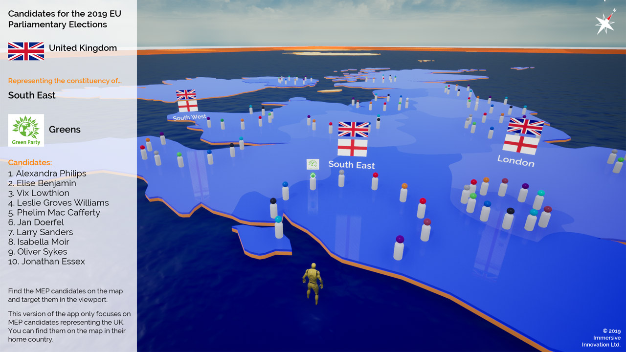
“Candidate Mode” allows users to explore the proposed representatives for the 2019 EU elections. The demo version of this application only includes United Kingdom candidates, plus details about their political party and the consituency they hope to represent.
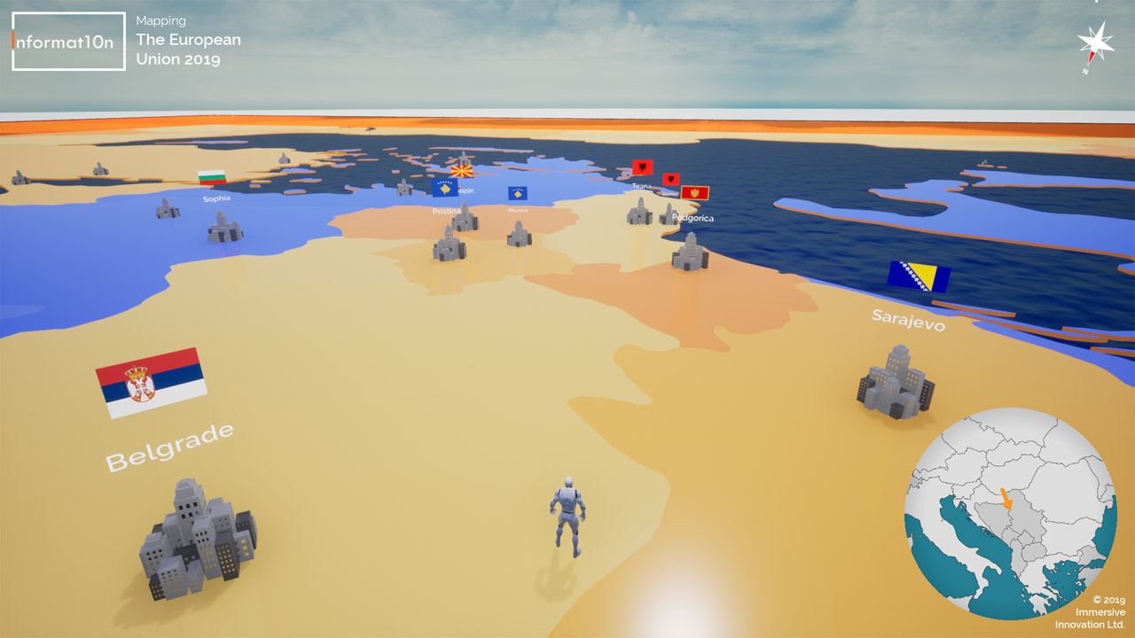
Users can freely explore Europe and the surrounding region in “Geography Mode”. This simplified map shows national borders, capital cities and major settlements based on their population. It’s an engaging way to learn about our world in a highly immersive and interactive way.
Collaborations and commissions
There is a world of useful data, maps and insights to explore. This application is only a demo, and it only shows a fraction of what we can offer. We make immersive 3D maps (like this one), plus interactive data dashboards and attention grabbing visuals for live presentations or events.
You can collaborate with us on your next project, or commission us to produce a high-impact data sharing tool. You might be surprised by how affordable it can be and by the production timescales involved. Get in touch to find out how your next report, presentation or campaign can blow people’s minds…and even change them.
data > information > knowledge > understanding > action
Contact Informat10n
Email: contact@informat10n.com
We are available 24/7 and can work with individuals, institutions and organisations from around the world.
We offer live demonstrations via Skype or Zoom.
Based in the London, we are also able to offer face to face meetings and demonstrations in the UK.
Further details can be found on our contact page >>