The Illuminate Project
Information is breathtaking
The Illuminate Project is an opportunity for anyone to turn raw data into an animated data visualization. We are inviting researchers, teachers and citizen scientists to submit interesting things to us. Each week we will select a set of data and transform it into an animated 3D chart. This data does not necessarily need be collected by you, but it must be in the public domain. If you have found something interesting or informative, send it our way and we will help you share it with the world.
Each data visualization will be recorded as a video and shared on this page, as well as on our YouTube channel. You will then be able to share this freely, and all data will be fully credited to its authors. It is free to participate in this project.
If you would like to find out more, simply download the spreadsheet from the link below. You can then fill in the data sheet and email it to us. When you submit your data please also tell us where it has come from, and why you think people would be interested in it. If you have any questions about the project then you can also email us at this address: contact@informat10n.com

Illuminate Your Data
Click this link button to download the Excel spreadsheet. In this document you will find further instructions and two data tables. Each table is clearly labelled and easy to use. Simply add yor data to the ‘line chart’ or ‘bar chat’ table and save your document. Then send it to us at contact@informat10n.com and include details about your data and its authors. We will contact you to let you know we have received it.
Bar charts
Bar charts can show up to 20 cases on the horizontal axis. They can be animated to show changes over time, and the bars can also be ordered from highest to lowest at each point in time. It’s also possible show fixed bar charts (without animation over time). The factor on the vertical axis can be any type of numerical data.
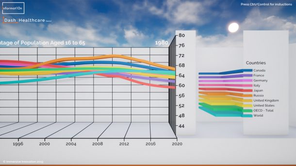
Line charts
Line charts can show up to 6 cases, each drawn as a separate line. The horizontal axis can show different points in time (up to 30 points) or it can show any categorical or numerical factor. The facor on the vertical axis can be any type of numerical data.
Contact Informat10n
Email: contact@informat10n.com
We are available 24/7 and can work with individuals, institutions and organisations from around the world.
We offer live demonstrations via Skype or Zoom.
Based in the London, we are also able to offer face to face meetings and demonstrations in the UK.
Further details can be found on our contact page >>