Coronavirus Data Project
Data Visualization & Mapping of the Pandemic
The spread of the Covid-19 virus is a global issue. It has already had a huge impact on societies around the world. It is a long-term problem which affects many areas of human life. It not only affects people personally, but is likely to have significant long-term implications for economic systems, political decision-making and healthcare. It is a major problem facing society.
Scientific study is the best way to understand the problem and to come up with solutions that can limit its spread and negative effects. It is therefore essential that governments and institutions have access to objective, accurate and reliable data. It is also an issue which many members of the public are interested in. Everyone should have have access good quality information, presented in an understandable way. This Coronavirus data project presents data that has been gathered from international sources. The aim of the project is to provide an online and shareable resource that is engaging and understandable for a wider audience.
Total Number of Cases
Daily New Cases
Total Number of Deaths
Daily Deaths
Cases per Million
Cases per Million (population over 1m)
Deaths per Million
Deaths per Million (poulation over 1m)
Mortaility Rate (% fatal cases)
Mortality Rate (% fatal cases, 1000+ cases)
Daily New Cases, per Million People
Daily Deaths, per Million People
Data Visualizations & Interactive Maps
Data Visualizations
On this page you will find a series of animated data visualizations. Each video explores a different factor and how this has changed over a 30-day period. The videos on this page will be regularly updated. Older videos can be found on our YouTube channel. On this channel you can also find several videos with commentary, giving further insights into what the data means.
![]() informat10n YouTube Channel >>
informat10n YouTube Channel >>
Interactive Map
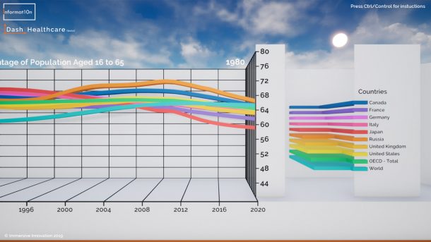
We are now developing a 3D data map that will present information in a beautiful, functional and engaging way. This will be released as a downloadable app that people can explore.
Data Sources
Most of the data included in these visualizations is provided by the World Health Organisation. The same information can be found in their regular Situation Reports. We also use population statistics from the United Nations. We may add further sources in the future.
A note on data quality
The Covid-19 pandemic has become a political issue, which means that organisations and governments around the world have different motives for the story that they would like to tell. This makes it difficult to know which information and sources to trust. The WHO collaborates with many instituations and healthcare organisations around the world to gathers evidence and from. The quality of this data depends on the methods used within each region. Misinformation and biased reporting are a significant issue. A reasonable amount of scepticism is healthy, but it is also important to work towards solutions and to use a rational and scientific approach, using the best data that is available. By keeping the public informed, and by promoting transparency, accountability and the sharing of evidence, we can help to improve the quality of the information that is available.
Contact Informat10n
Email: contact@informat10n.com
We are available 24/7 and can work with individuals, institutions and organisations from around the world.
We offer live demonstrations via Skype or Zoom.
Based in the London, we are also able to offer face to face meetings and demonstrations in the UK.
Further details can be found on our contact page >>

