Dash: Healthcare
3D Data Visualization Dashboard
This is a cutting-edge piece of data visualisation software that allows users to explore international healthcare statistics in a way that is easy to use, easy to understand and beautiful to look at. It is designed to give all users an interactive, intuitive and engaging experience, with a focus on evidence-based learning and self-directed exploration of the facts.
Dash: Healthcare is a stand-alone application that is available for Windows PC and Mac. It can be downloaded onto any modern computer via the internet and does not require an internet connection to use the application. This page introduces the concept and features of the app, and we highly recommend viewing the video or trying it yourself first-hand. This piece of software is available as a free download. You can find the download link below the video.
The 3D Data Dashboard
Dash is unlike any other data visualisation software, because it allows users to interact with data in three dimensional space. Users take control of a character that can navigate the 3D dashboard and interact with the visualisations on display.
It has an easy-to-use interface that is designed to be as intuitive as possible, even for new users and people who aren’t so familiar with computers. Users move from left to right using a gamepad or the arrow keys on their keyboard. People can then interact with selection boxes to choose which data they wish to explore. One way to describe it is as “a cross between Super Mario and an Excel database”.
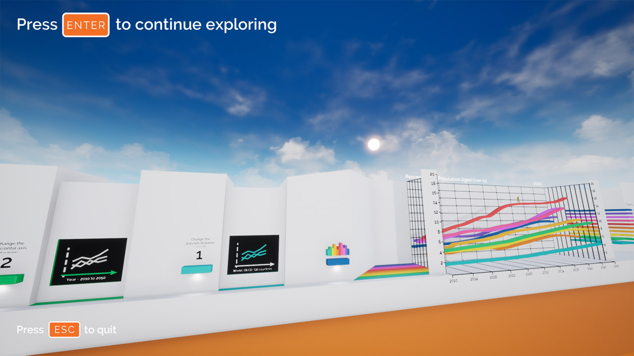
Users start on the left side of the dashboard and begin their journey by moving to the right. There is an introduction video at the start, which gives instructions on how to use the application. Familiar users can run past this intro and start exploring the data.
There are then four selection boxes which can be used to change the chart or data visualisation on display. Hitting the first box changes the healthcare topic being explored. This also displays a video which introduces the topic and the afactors that can be explored. The second box changes the factor that is shown on the vertical axis of the chart. The third changes the factor on the horizontal axis, and the fourth is used to make other optional changes which depend on the specific chart.

The Dash is a 3D data dashboard that flows from left to right. In this screenshot you can see the left side, which includes an interface for selecting the chart you wish to view. It also includes video screens which give instructions for new users and which introduce each healthcare topic.
On the right hand side you can see the data visualisation area . This is where bar charts, line charts and other data visualisations are loaded. Users can interact with the data in innovative new ways that can dramatically increase engagement and understanding, such as by animating charts to show changes over time.
Charts & Data Visualisations
The appearance of each chart depends on the type of data being explored. The data visualisation options include 3D bar charts, line charts and scatter plots. Every chart is designed to be as clear and informative as possible.
It is possible to interact with each type of 3D chart in a unique way. Users can explore trends over time by walking along the lines of a line chart. Likewise, users can jump along the bars of bar chart and also animate these bars to show changes over time. Scatter plots can be used to visualise the correlation between factors, and these bivariate comparisons can be animated to show how relationships develop over time.
Dash is also perfect for use in presentations or for giving demonstrations and exploring data as a group. Every chart has a unique 4-digit ID number that corresponds to the 4 selection boxes. This allows users to easily make a note of their favourite visualisations and to change the chart in just a few seconds, without needing to move away from the chart area.
It is also easy to change the zoom level, either to get a closer view of your character, or to zoom out and get a full-screen view of any chart. The visual style of each chart can also be customised with a range of beautiful colour schemes. It’s even possible to change the colour of the character avatar.
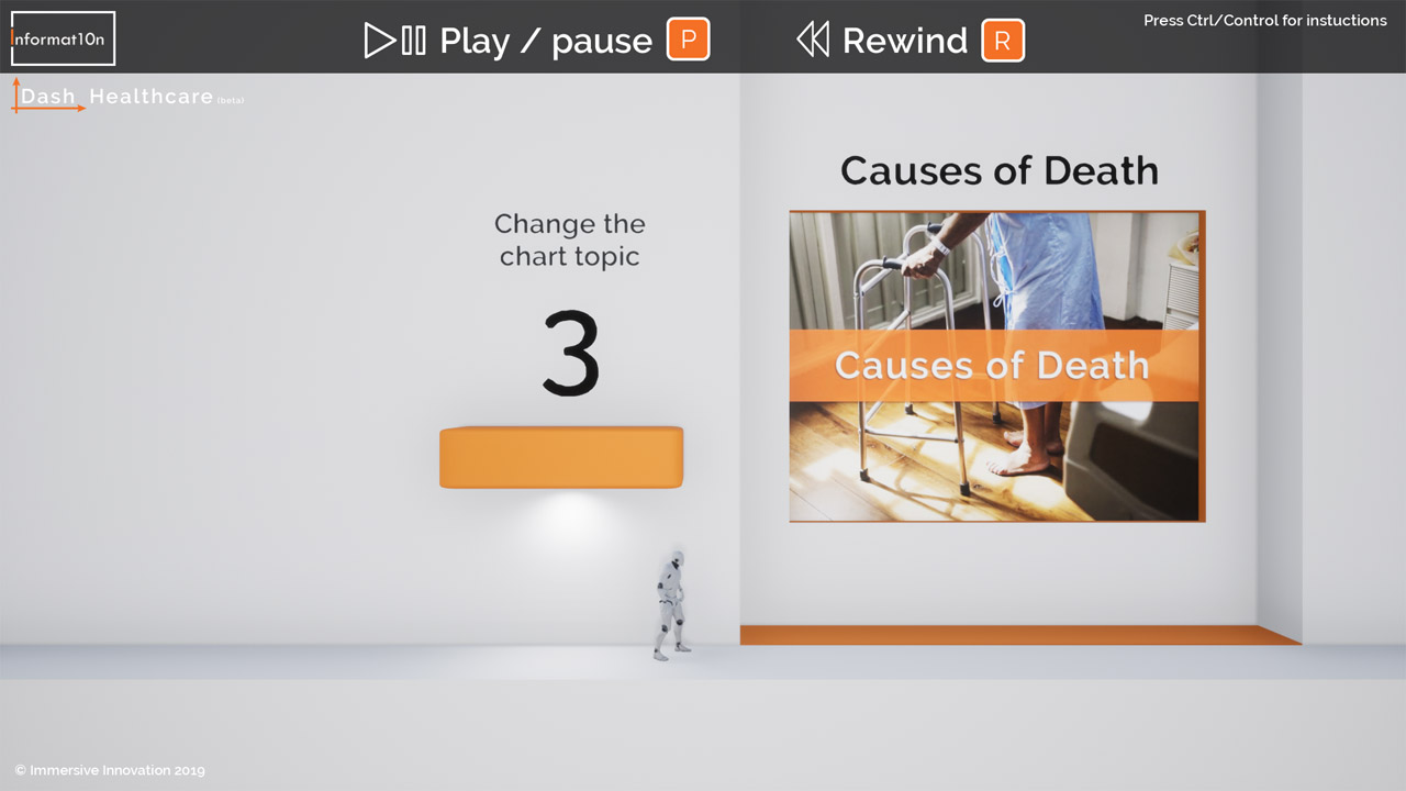
The first selection box allows users to change the topic that is being explored. Each topic also has an introductory video so that users can watch, listen and learn about the data that is available. The layout is incredibly simple and intuitive, with clear visuals showing exactly what each selection box does.
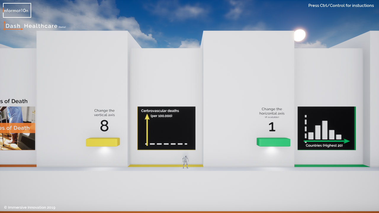
In this screenshot we can see the second and third selection boxes. These change the factors on the vertical and horizontal axes of the chart. Users can also select charts using the numbers on their keyboard. This is a quick way of changing the data visualisation in seconds, making it perfect for live presentations.
Sharing and creating content
This is a versatile piece of software that has been designed for a number of uses. Individuals and groups can use the information and data visualisations within this app for research, academic study, presentations, or out of personal interest in the topic.
It is also a powerful tool for creating new content. It can be used to capture and record an infinite number of images and videos. This allows researchers, journalists, campaigners, activists, podcasters and content creators to quickly and easily produce high-quality visuals. This means that people without access to a PC or Mac can also learn from content that is distributed and disseminated by others. We can make this possible by sharing the application under a Creative Commons (CC BY-ND) licence. This enables people to share its copyright content, as long as they correctly attribute it and do not edit the original content.
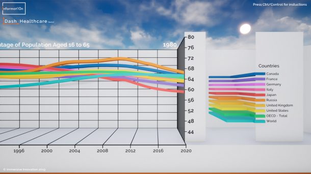
Line charts can show up to ten lines of data, allowing easy comparison and interpretation of trends. Users can move along each line of the chart to get a clear understanding of how individual datasets change over time. Charts are 3-dimensional but can also be ‘flattened’ to give a clear view of how the lines cross each other.
Bar charts can include up to 20 bars, and can be animated to show changes in data over time. There are a range of beautiful colour schemes to choose from and these can be changed easily for each data visualisation. The value of each data point can also be shown on the bars, and this can be toggled on or off.
Collaborations and commissions
There is a world of useful data, maps and insights to explore. This application is only a demo, and it only shows a fraction of what we can offer. We make interactive data dashboards (like this one), plus immersive 3D maps and attention grabbing visuals for live presentations or events.
You can collaborate with us on your next project, or commission us to produce a high-impact data sharing tool. You might be surprised by how affordable it can be and by the production timescales involved. Get in touch to find out how your next report, presentation or campaign can blow people’s minds…and even change them.
data > information > knowledge > understanding > action
Contact Informat10n
Email: contact@informat10n.com
We are available 24/7 and can work with individuals, institutions and organisations from around the world.
We offer live demonstrations via Skype or Zoom.
Based in the London, we are also able to offer face to face meetings and demonstrations in the UK.
Further details can be found on our contact page >>