Interactive 3D Maps
Maps are one of the oldest and most powerful ways of representing data. With a 3D interactive map you can situate your data within the real world and give users the opportunity to explore it at their own pace. This page introduces some of their features and how they can be used to inform, engage and inspire.
Skip to section: >> 1. Information Resources >> 2. Engage & Motivate >> 3. Every Kind of Content >> 4. Revolutionary Data Dashboards >> 5. Enable & Inspire Action >> 6. Bring a Story to Life >> 7. Archives & Taxonomies >> 8. Active Learning & Testing >> 9. Distribution & Access >>
Real World Data
Presenting information on an interactive 3D map gives users a clear understanding of how evidence relates the real world.
Global Maps & Borders
Situate your data and evidence in the real world. Allow people to explore and visualise global topics clearly.
Domestic regions
Show regional data, divided into smaller areas such as democratic constituencies, states, provinces or cities.
View local areas in detail
Visualise local infrastructure, industry or social factors using 3D models and toggle-able data layers.
Interactive Exploration
Users can interactive with the map to access any kind of information whilst exploring from a human perspective.
Memorable & high-impact
By combining rich 3D visuals with multimedia video and sound you can give people a rewarding and powerful experience.
Engaging & Fun
Users are free to explore the data in their own way, or can be motivated with task-setting and gameplay elements.
Clear communication
Present complex data in a way that can be easily and intuitively understood by anybody, without the need for further guidance.
Rich & Clear Visuals
Vision is the most powerful of the five human senses and it offers the greatest potential when it comes to connecting with your audience and making an impact.
Representing Geography
Any aspect of the physical world can be represented graphically, either in 3D or 2D, and in a way that is either realistic or symbolic.
The 3rd Dimension
People have an intuitive understanding of 3-dimensional space because it is true to the world we live in.
Layers of meaning
Any kind of data can be represented visually on the map, with data layers that can be turned on or off at will.
Political Representation
3D interactive maps are a powerful tool for understanding social and political factors, whether is at the local, constituency or regional level.
Democratic constituencies
Maps can be broken down into chunks to show demographic data, voting trends and democratic systems.
Representation & Policy
Political representatives can be shown alongside their voting record, the policies they support and details of their affiliations.
Voting & Campaigning
Campaigners and journalists can use interactive resources to present information about policies and future candidates.
Data Animations
One of the benefits of an interactive app is that animation can be used to show trends, comparisons and changes in data.
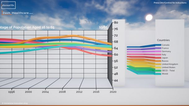
Interactive Graphs
Users can interact with 3D bar charts, line charts and scatter plots to get a deeper understanding of how to interpret the evidence
Changes over time
Animations can show how figures change over time, and how these changes coincide with other phenomena
Selecting datasets
Various datasets and visualisations can be shown simultaneously to investigate connections and understand causes
Analysis & Comparison
Advanced statistical analysis can be included to show significant relationships between factors or to make predictions and present forecasts.
Explore correlations
Visualise the relationship between factors, show regression lines and use coefficients to make predictions
Compare regions
Select regions on your map and see how they compare with one another on a range of factors.
Trends over time
Clearly show changes over time, or project your data into the future and present a range of possible outcomes
Easy Access & Distribution
Share your application around the world via email, on the web or in an app store.
Skip to section: >> 1. Information Resources >> 2. Engage & Motivate >> 3. Every Kind of Content >> 4. Revolutionary Data Dashboards >> 5. Enable & Inspire Action >> 6. Bring a Story to Life >> 7. Archives & Taxonomies >> 8. Active Learning & Testing >> 9. Distribution & Access >>